ListView header Styling is one of the most difficult styling pieces I’ve had to deal with. Part of this is because it is just another part of the seemingly endlessly complex listview. The other part is just because of the way the styling for the listview is put together in WPF.
In this post, we’re going to change the default color of the header (background and foreground) and make the headers look more like bubbles. Why? Because we can! (Everytime I say that, somewhere a usability expert loses a little bit of their soul.)
Take note that anything done in this will affect the whole header. If you’re looking to do something to one individual column in the header, you need to go to this post on ColumnHeaders (coming soon). See the bottom of this post for more details.
As a point of note, the easy way in this particular case involves going directly into the XAML and the hard way involves going through the steps in Blend. The easy way is posted at the bottom.
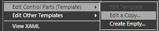
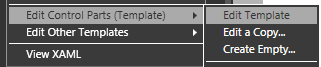
Now for the hard way. First, go to your listview, right click on it and go to:
Edit Control Parts (Template) -> Edit a Copy…
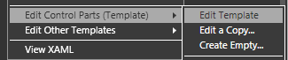
You’ll be given the basic template of your listview. Right-click on the scrollviewer and go to:
Edit Control Parts (Template) -> Edit Template
You’ll be given the default scrollViewer template for the specialized scrollViewer used in the ListView. In addition to the normal scrollviewer parts, it has a control that acts as the holder for the header called the “GridViewHeaderRowPresenter”.
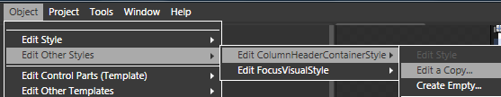
Highlight the GridViewHeaderRowPresenter (which I am renaming “steve” so I don’t have to write that anymore) and, in the menu, go to:
Object -> Edit Other Styles -> Edit ColumnHeaderContainerStyle -> Edit a Copy…
This is where we are going to want to change the foreground and background.
Go over to the Properties panel to the right and click on foreground, giving it a solid color brush (I’m going to use a dark blue). Do the same thing with the background (light blue)and the BorderBrush (blue gradient) (you’ll see why in a moment).
Now my style looks like this in the XAML:
<Style x:Key=”CustomHeaderStyle” TargetType=”{x:Type GridViewColumnHeader}“>
<Setter Property=”Background” Value=”#FFCDE7F4” />
<Setter Property=”Foreground” Value=”#FF07034B“/>
<Setter Property=”BorderBrush“>
<Setter.Value>
<LinearGradientBrush EndPoint=”0.5,1” StartPoint=”0.5,0“>
<GradientStop Color=”#FFA1CCE0” Offset=”0“/>
<GradientStop Color=”#FFABD5EA” Offset=”1.0“/>
</LinearGradientBrush>
</Setter.Value>
</Setter>
<Setter Property=”Template“>
…
</Style>
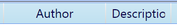
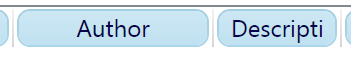
and my column headers look like this in the composition (zoomed in to 200%):
But wait… there’s more. Right click on your ColumnHeaderContainerStyle in the Objects and Timeline panel and select:
Edit Control Parts (Template) -> Edit Template…
Finally, we are in the real guts of the header template, which means we have all the bits and pieces to make it work.
Note: I’ve recently had a comment on how to style the header gripper (the part of the column header that allows you to resize the column), but this post is already getting way too long, so I deal with it in this post over here (coming soon).
OK, so now we can really get at the look of this sucker. If you’re using Vista, you probably have some Borders with names like “UpperHighlight”, “HeaderHoverBorder”, and “HeaderPressBorder”. These are borders that alter the look of the headers when certain triggers are active. We’ll be ignoring them for the sake of simplicity.
(At this point, my readers are saying to themselves, “Simplicity? SIMPLICITY? At what juncture in this entire post have we even approached simplicity.” To which I reply “Hey, don’t kill the messenger.”)
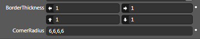
So go to the highest border (in my case, it’s called the “HeaderBorder”) and do the following:
- BorderThickness=”1,1,1,1“
- CornerRadius= “6,6,6,6“
- Margin=”2,0,2,0“

The header now looks like this:
This is the hard way because it uses Blend exclusively without touching the XAML.
The Easy Way
The easy way is also the better way from a XAML perspective. Simply create a create a Style like so:
<Style x:Key=”CustomHeaderStyle” TargetType=”{x:Type GridViewColumnHeader}“>
</Style>
and add it to your ListView like this:
<ListView>
<ListView.View>
<GridView ColumnHeaderContainerStyle=”{DynamicResource CustomHeaderStyle}“>
….
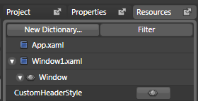
Access it though your resources tab to get to the visual designer interface for your new style:
Once you’ve done this, you can skip directly to the part of the tutorial where you start changing the foreground and background.
Hopefully, at this point you feel like you have a pretty decent handle on the basics of styling your header section. Because it’s getting really late and I’m getting really tired.
But before I go, let’s get one thing absolutely clear: When it comes to ListView headers, you can technically do most of this in the data template, but if you do, you’ll make baby Jesus cry.
Here is why. By doing things as we have done them above, we get the following:

If we do all this work in the data template, we instead get this:

Which brings about the aforementioned consequences. You’ve been warned.
Questions about column headers:
- How do I wrap text in a header?
- How do I make headers sort columns (and how do I style for that)? (coming soon)
- How do I make one header look different than the other headers? (coming soon)
For example, if the USA VPN server is far from the source computer,
the connection is slower. USA is one which allows its countries member to accees
the net freely. These public facing addresses usually have nothing in common with the addresses of devices connected to the organization’s LAN or WAN.
Hi, Neat post. There is a problem with your site in internet explorer, would test this IE still is the market leader and a large portion of people will miss your magnificent writing due to this problem.
An added invaluable entry right from http://www.designersilverlight.com/2008/01/16/styling-the-listview-column-header/. I have been having fun with your web site for a little bit at this stage and I find that you happen to be certainly really going upwards in the search rankings making me glad.
Another nice tutorial. Would be nice if you posted all the generated XAML, so that people could see how to style a list view this way without using Expression Blend.
Thanks for this Matthias! I’ve been dreading taking on the infamous listview control for styling, and your tutorial has given me a fantatsic start. I noticed in the example you gave when you store the style in the data template, there is no colouring for the “non-column” to the right… I think that actually looks better. How can one remove that colouring so only headings have a background, and the background is transparent for the rest of the header where no headings are present?
Thanks again.
Thanks for posting this. It was a big help for me.
Did you follow the steps so that you have a template for your listview and for your scrollviewer? I double checked in the latest Blend (June 2008 Preview) and it still works.
Make sure you have the GridViewHeaderRowPresenter highlighted in your “Objects and Timeline” view before you go to the Objects menu option.
Hi,
I think you missed couple of steps which is making it more difficult to follow:
I do not get to the following option: Object -> Edit Other Styles -> Edit ColumnHeaderContainerStyle -> Edit a Copy…
I don’t see the ColumnHeaderContainerStyle option.
Great post!
Ok, so now, let’s just wait for that post about sorting rows by clicking on the column header. I’ve been trying to set the MouseLeftButtonDown event to the column headers and catch it, but sofar it has given me a hard time…
Rainer
Nevermind, i’ve found it …
I’ve got a problem. After step: Edit Control Parts (Template) -> Edit Template text says: You’ll be given the default scrollViewer template for the specialized scrollViewer used in the ListView. In addition to the normal scrollviewer parts, it has a control that acts as the holder for the header called the “GridViewHeaderRowPresenter”.
But i can’t see GridViewHeaderRowPresenter. I have following controls DockPanel and inside of it PART_HorizontalScrollBar and Part_VerticalScrollBar. There is another DockPanel with two rectangles inside it.
The next step is Object -> Edit Other Styles -> Edit ColumnHeaderContainerStyle -> Edit a Copy… … But i can’t see ColumnHeaderContainerStyle … Heeeelp pls
Thanks Matthias, cool tutorial. I was really stuck on ListView styling and running out of time, this has helped big time.
I’m currently using the December Preview, but I don’t think it should matter. I would reccomend the Deceber Preview anyway…
Great Blog!
What version of the Blend do you use? I have Blend 2 September Preview and I think that I don’t have the all your options… Should I install December Preview?
A great resource, Matthias – Thanks! Hope you’ve got more in store.
Jason, I’m guessing that the reason the DataTemplate version is truncated is that it trawls through the data as it’s told to, but once it runs out of data to deal with (resulting in this case in no more columns) it loses interest and stops formatting. The ControlTemplate on the other hand doesn’t care about data, so it will create the headers, size those that have content, and then fill the remaining available space in the style formatting that has been laid down.
Thanks, Matthias, this was extremely helpful.
I’m still a bit curious as to why there’s such a big difference between the data template way and the styling way in the space beyond the columns, but perhaps that is one of the Great Mysteries Of Life….