This is a post that has taken months to complete, but addresses something that I don’t think I’ve seen sufficiently covered for anyone who is new to WPF. Resultantly, we’re going to go through it slowly and I’m officially begging for additional questions at the end.
Part of the problem with styles and templates in WPF stems from the fact that Blend allows a wonderfully simply way of creating a copy of a template:
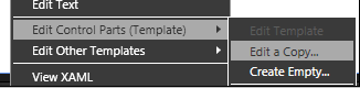
It then gives you something that looks like this:
<Style x:Key=”My_Template” TargetType=”{x:Type Button}“>
<Setter Property=”Template“>
<Setter.Value>
<ControlTemplate TargetType=”{x:Type Button}“>
<!– blah blah blah –>
So, from a usability point of view… I told it to create a Template and it created a style. I judged from this that styles and templates were roughly the same thing.
And I was confused.
So, first, I’ll try to explain styles and templates by explaining how they work and then I’ll draw an analogy that I hope is helpful.
Let’s say you have a button.

You can change all sorts of properties of that button… visibility, background, width, height, margins, border thickness, alignment, font, whatever.
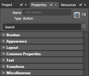
If you have a dozen buttons and you want them all to have the same properties, you can create a button style that specifies those properties and assigns them across the board. You can edit a style in Blend by selecting your control, clicking in the menu: “Objects -> Edit Style -> Edit a Copy…“.
Style editing in the objects tab will look like this.
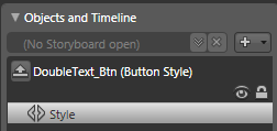
As you can see, there are no objects in the visual tree to play with… only properties to assign in the properties tab.
When you assign a property in Blend, your styles will save that assignment as setters and values. Let’s say we wanted all of our buttons to have green 18 point font bold text. We could create a style that looked like this:
<Style x:Key=”GreenBorderButton” TargetType=”{x:Type Button}“>
<Setter Property=”Foreground” Value=”#FF00FF00” />
<Setter Property=”FontSize” Value=”18“ />
<Setter Property=”FontWeight” Value=”Bold” />
</Style>
The styles can only define properties that belong to the control type that they are styling (which is defined in the “TargetType“). Also, styles can only give information for properties the control already has and only in the way that the control is already set up. For example, because there is no property for changing the corner radius of a button, you can’t change the corner radius of a button using a button style.
However, what if we want to change something about the button that we can’t change with the given properties? For example, let’s say we wanted to see all the text show up twice.

In order to do this, we need to make what I’m going to call “structural changes” to our control. Structural changes are changes in the actual guts of the control, changes to the base elements that make up the control. For this we need a control template.
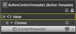
Boiled down to their essence, templates are little chunks of XAML that are inserted whenever you use your control. When you right click on something and go to “Edit Control Parts (Template) -> Edit a Copy…“, Blend takes the default XAML that makes up your control and places it in the resources so that you can change it at your whim.
You can get to the Control Template using the right-click method described at the top of this post. Your basic button template will look something like this:
<Style x:Key=”MyButtonStyle” TargetType=”{x:Type Button}“>
<Setter Property=”Template” Value=”{DynamicResource MyButtonTemplate}” />
</Style>
<ControlTemplate x:Key=”MyButtonTemplate” TargetType=”{x:Type Button}” >
<Microsoft_Windows_Themes:ButtonChrome x:Name=”Chrome” >
<ContentPresenter />
</Microsoft_Windows_Themes:ButtonChrome>
</ControlTemplate>
We can go in and add an additional ContentPresenter in here, like so:
<ControlTemplate x:Key=”MyButtonTemplate” TargetType=”{x:Type Button}” >
<Microsoft_Windows_Themes:ButtonChrome x:Name=”Chrome” >
<Grid>
<Grid.RowDefinitions>
<RowDefinition Height=”.5*” />
<RowDefinition Height=”.5*” />
<Grid.RowDefinitions>
<ContentPresenter Grid.Row=”0” />
<ContentPresenter Grid.Row=”1” />
</Grid>
</Microsoft_Windows_Themes:ButtonChrome>
</ControlTemplate>
And now our button shows all the content twice, one right on top of another.
The best way I’ve found to think about it is to think of your control as a car.
The dealer give the buyer a list of things that they can change about the car… interior color, leather or fabric seats, 4 or 6 cylinder engine… these are properties of the car… defined in the car “style”. (Basically, you can think of everything that you’re allowed to tweak at this website as the style of the car.)
<Style x:Name=”MySpecialCar” TargetType=”{x:Type Camry}” >
<Setter Property=”ExteriorColor” Value=”Blue” />
<Setter Property=”TransmissionType” Value=”5SpeedManual” />
</Style>

But let’s say that the buyer doesn’t want a normal seat… she wants a big comfy chair in place of the regular drivers seat. This is something outside of the scope of the list of things she was allowed to choose from, so they have to draw up new blueprints for making this new car. They have to create a new car “template”.
If our normal Camry blueprint looks like this:
<ControlTemplate x:Key=”MySpecialCarBlueprint” TargetType=”{x:Type Camry}“>
<CamryFrame x:Name=”CamryFrame” >
<Seat Type=”Drivers ” />
<Seat Type=”FrontPassenger” />
<Seat Type=”BackBench” />
</CamryFrame>
</ControlTemplate>
We can go in and replace :
<Seat Type=”Drivers ” />
With
<Seat Type=”ComfyChair” />
You may also notice that, with this model we could get rid of all the other seats except the drivers seat or we could add 12 new rows of seats. We can change anything about the car because we’re down into the original car blueprint.
This is the basic difference between styles and templates.
- A style is a list of properties that can be assigned in bulk to a control.
- A template goes a big step further and actually defines the underlying structure of the control.
You may be asking: “So how do these two work together? And what is this Data Template think I keep hearing about?”
Given that this post is getting dangerously long already, I’m going to address those issues in a couple more posts on styles and templates.
I’ll end on this note: if you are working in WPF and you’re having trouble with styles and templates, please read all of these posts (as I get to them) and ask questions in the comments section. I’m pretty good about getting to the comments questions and if the question is big enough, I’ll write a whole post on it. There are few things more vital to a WPF developer/designer than to have a firm grasp on styles and templates. It is in this understanding that the power of WPF really comes out.
- Who’s The Boss? Property Priority in Styles and Templates (coming soon)
- Create Conditional Styles and Templates (With the Magic of Triggers) (coming soon)
- So How Do Data Templates Fit Into All This? (coming soon)
Please let me know if you’re looking for a article writer
for your blog. You have some really great articles and I believe I would be a good asset.
If you ever want to take some of the load off, I’d
absolutely love to write some articles for your blog in exchange for a link back to mine.
Please blast me an e-mail if interested. Cheers!
Link exchange is nothing else however it is only placing the other person’s blog link on your
page at proper place and other person will also do same
in support of you.
Appreciating the dedication you put into your website and in depth information you present.
It’s awesome to come across a blog every once in a while that isn’t the same old rehashed information. Excellent read!
I’ve bookmarked your site and I’m including your RSS feeds to my Google account.
My brother recommended I might like this blog.
He was totally right. This post actually made my day.
You cann’t imagine simply how much time I had spent for this info!
Thanks!
Hello There. I found your bkog using msn. This is a very well
written article. I will make sure to bookmark it and
return to read more off your usewful information.
Thabks for the post. I will definitely return.
Great! Am new to WPF and was actually asking this exact question how styles and templates differ and there you have it. Bang on target 🙂
lol, the comment spam above is pretty hilarious. er.. Sorry. Great article Matthias!
At http://www.xamltemplates.net you can see a lot of styles xaml and one for free to download including the complete blend project.