The ComboBox is not the most complex of the WPF applications, but it can be a little tricky, so lets do a general overview post of it before we go into the specifics of how we’re going to make it work.
First of all, if you’re going to test your comboBox design, you should have it hooked up to an ItemsSource. Don’t have one? I have a tutorial in which I walk through attaching an RSS feed to your control. It was originally written for the ListView, but it will work fine for a ComboBox.
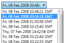
To start out… this is your standard ComboBox:
When working on a comboBox, you have a couple of options for the Items inside the ComboBox. If the options never change and are not data-driven, you can just toss come ComboBoxItems into it. Otherwise, you can connect it to some kind of ItemsSource (see the link above).
All of my examples are done with a data-driven ComboBoxes, but you should get the desired results if you run through the tutorials with ComboBoxItems.
First, a little bit about the structure of the comboBox.
The comboBox consists of a couple basic elements. The main part that you would normally click on is a ToggleButton. The information we can see is a ContentPresenter. When you open the ComboBox, you get a popup that is holding an ItemsPresenter.
The ComboBox is a little different inasmuch as it has both a ContentPresenter and an ItemsPresenter, which means that it can take in two different DataTemplates for these different presenters. (If all this is confusing to you, subscribe to my RSS feed… I’m working on a guide to Styles and Templates which will explain all this in detail.)
Anyway, in the spirit of my guide to the ListView, I’m just going to spend the rest of the time guiding you through the basics of how to style the ComboBox. As I get to it, I’ll write the accompanying articles going into each in detail.
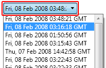
Question 1: “How do I style the items in the dropdown?”
Answer: Use the ItemContainerStyle and the accompanying template to define the look and feel of the items.
How to edit the ComboBox ItemContainerStyle in Blend
In the XAML:
Put this in the resources:
<Style x:Key=”MyComboItemStyle” TargetType=”{x:Type ComboBoxItem}“>
</Style>
Put this in the composition:
<ComboBox ItemContainerStyle=”{DynamicResource MyComboItemStyle}” />
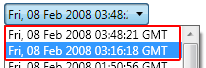
Question 2: “How do I change the look of the main ComboBox button (highlighted below)?”
Answer: Use the standard Style and Template properties.
How to Style the main ComboBox in Blend (coming soon).
In the XAML:
Put this in the resources:
<Style x:Key=”MyComboStyle” TargetType=”{x:Type ComboBox}“>
</Style>
Put this in the composition:
<ComboBox Style=”{DynamicResource MyComboStyle}” />
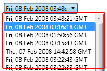
Question 3: “How do I style the ComboBox dropdown (highlighted below)?”
Answer: Go to the Popup control inside the ComboBox template.
How to style the ComboBox drop down in Blend.
In the XAML:
Put this in the resources:
<Style x:Key=”MyComboStyle” TargetType=”{x:Type ComboBox}“>
<Setter Property=”Template“>
<Setter.Value>
…
<Popup x:Name=”PART_Popup” >
<!– Edit here –>
</Popup>
…
</Setter.Value>
</Setter>
</Style>
Put this in the composition:
<ComboBox Style=”{DynamicResource MyComboStyle}” />
There are, of course, other questions related to the ComboBox, but this is just the basics. I’ll look at some of the more intense ComboBox styling tasks in the near future.