One of the questions I get most often from designers and almost never from developers is:
How can I get drop shadows into my application without killing my performance?
It is, of course, easy as punch and pie to get drop shadows into your application. You can just use the Bitmaps Effects panel in the Appearance section:
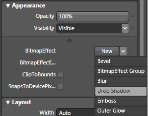
For the love of God, please do not use the Bitmap Effects in the Appearance section!
If any developers found out that I told you to use BitmapEffects, they would hunt me down and cut off my fingers. This is because, while the Bitmap Effects in WPF are all sorts of cool, they make your computer break down into uncontrollable sobbing. Bitmap Effects hog system resources by requiring software rendering for render-heavy effects. There is no better way to slow down a perfectly good application than to give every other element a drop shadow.
But, what if you really really want to?
That is why there is this handy little thing called a “SystemDropShadowChrome”. The way to use it is to put the following namespace into your Window tag:
xmlns:dropShadow=”clr-namespace:Microsoft.Windows.Themes;assembly=PresentationFramework.Aero”
And then take the thing you want to have a drop shadow and wrap it in a SystemDropShadowChrome like so:
<dropShadow:SystemDropShadowChrome>
<Grid x:Name=”MyElement” />
</dropShadow:SystemDropShadowChrome>
So what are we losing when we do this?
Normal bitmap dropshadows give you the following options:
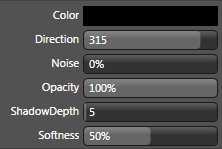
And they conform to the item to which they are attached. It could be bannana-shaped… you would get a banana-shaped drop shadow.
But with SystemDropShadowChrome, you get a rectangle and the ability to choose the color of your drop-shadow and the corner-radius. That’s it. But that gives you a decent amount of room to work with. Consider what Robby Ingebretsen did in his example on SystemDropShadowChrome (magnified 2X):

We’ve got darker drop shadows, lighter drop shadows, colored drop shadows and a drop shadow with an irregular corner radius. This is flexible enough for pretty much any standard application control. Used in templates, you could even use this to give drop shadow to just one part of the control. In fact, my attention was first drawn to the use of the drop shadow in the Popup part of the ComboBox control.
You can change the drop shadow color using a standard color picker in the “Miscellaneous” section of the SystemDropShadowChrome properties in Blend:
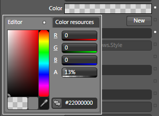
This is also where you can find the “CornerRadius” property. In the XAML, they will look like this:
<dropShadow:SystemDropShadowChrome CornerRadius=”3,13,3,13” Color=”#71000000“>
<Grid x:Name=”MyElement” />
</dropShadow:SystemDropShadowChrome>
With some creative styling, we can actually change the direction of the drop shadow. It’s easy enough to do if you’re just hacking away, but if you plan on using it seriously in an application, it requires some forethought and organization, so I’ll go into that in detail in a full post on changing the SystemDropShadowChrome direction. (coming soon)