If you are like me, you’re working on Windows Phone 7 applications in your pajamas, subsisting on pork jerky and Coke Zero and dreaming of that one project that will make you richer than your wildest dreams while begging Dell to actually announce some kind of release date for the Dell Venue Pro.
But I suspect that we have less in common. In fact, the only thing we probably have in common is a desire to know how to actually replicate the Windows Phone 7 motion design.
That and our breathtaking good looks.
But back to the motion design. If you download the Silverlight Windows Phone toolkit source code, download and run it, you’ll see some animations that look kind of like the animations on the phone but not really. There are a couple of reasons for this.
Reason #1 – The easing functions have been placed on the wrong keyframes in the toolkit. They should be placed on the second keyframe, but they are on the first keyframe. This, of course, doesn’t make any sense since there is nothing to ease in the first keyframe, so I suspect it is some kind of transcription error.
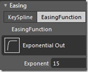
Reason #2 – The easing function is an exponential one. Not a problem, pretty normal. But its exponent is 15. To give you a good idea of what that kind of “easing” looks like, here is the Blend representation of an exponent 15 easing:
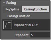
It’s basically like cutting the animation time by two thirds. In contrast, here is the function with an exponent 5 easing:
Much ease-ier (get it?).
OK… enough about the Silverlight toolkit. You want to actually know how to write animations that approximate Windows Phone 7, right?
I currently have no phone, so I can’t study the animations in the closest detail (waiting for the Dell Venue Pro), but here is what I’ve gathered from the Silverlight toolkit and what I can see in the emulator:
“In” animations
When some UI component is appearing, we would use an “In” animation. “In” animations are a shade longer than “Out” animations. I assume this is to help the users’ eyes adjust to the new UI.
To the best of my knowledge, “In” animations:
- are .35 seconds long
- use exponential 5 easing
“Out” animations
When a UI component is exiting (either through navigation or due to the lack of need for it) we use an “Out” animation. Their shorter length leave the user with the impression of speed when they want to get to the next UI.
“Out” animations:
- are .25 seconds long
- use exponential 5 easing
OK… now on to some XAML:
Turnstile Animations:
This is when the screen-wide UI turns on its left-hand edge, such as when the user opens an application.
Turnstile Forward In
- <DoubleAnimationUsingKeyFrames Storyboard.TargetProperty=”(UIElement.Projection).(PlaneProjection.RotationY)”>
- <EasingDoubleKeyFrame KeyTime=”0″ Value=”-80″ />
- <EasingDoubleKeyFrame KeyTime=”0:0:0.35″ Value=”0″>
- <EasingDoubleKeyFrame.EasingFunction>
- <ExponentialEase EasingMode=”EaseOut” Exponent=”5″/>
- </EasingDoubleKeyFrame.EasingFunction>
- </EasingDoubleKeyFrame>
- </DoubleAnimationUsingKeyFrames>
Turnstile Forward Out
- <DoubleAnimationUsingKeyFrames Storyboard.TargetProperty=”(UIElement.Projection).(PlaneProjection.RotationY)”>
- <EasingDoubleKeyFrame KeyTime=”0″ Value=”0″ />
- <EasingDoubleKeyFrame KeyTime=”0:0:0.25″ Value=”50″>
- <EasingDoubleKeyFrame.EasingFunction>
- <ExponentialEase EasingMode=”EaseIn” Exponent=”5″/>
- </EasingDoubleKeyFrame.EasingFunction>
- </EasingDoubleKeyFrame>
- </DoubleAnimationUsingKeyFrames>
Turnstile Backward In
- <DoubleAnimationUsingKeyFrames Storyboard.TargetProperty=”(UIElement.Projection).(PlaneProjection.RotationY)”>
- <EasingDoubleKeyFrame KeyTime=”0″ Value=”50″ />
- <EasingDoubleKeyFrame KeyTime=”0:0:0.35″ Value=”0″>
- <EasingDoubleKeyFrame.EasingFunction>
- <ExponentialEase EasingMode=”EaseOut” Exponent=”5″/>
- </EasingDoubleKeyFrame.EasingFunction>
- </EasingDoubleKeyFrame>
- </DoubleAnimationUsingKeyFrames>
Turnstile Backward Out
- <DoubleAnimationUsingKeyFrames Storyboard.TargetProperty=”(UIElement.Projection).(PlaneProjection.RotationY)”>
- <EasingDoubleKeyFrame KeyTime=”0″ Value=”0″ />
- <EasingDoubleKeyFrame KeyTime=”0:0:0.25″ Value=”-80″>
- <EasingDoubleKeyFrame.EasingFunction>
- <ExponentialEase EasingMode=”EaseIn” Exponent=”5″/>
- </EasingDoubleKeyFrame.EasingFunction>
- </EasingDoubleKeyFrame>
- </DoubleAnimationUsingKeyFrames>
Slide Animations
We see these animations in things like creating new e-mails. They seem to be used when the user is doing some task that fits within the context of the screen they are already on. Slide animations use an opacity animation combined with a horizontal or vertical animation.
Slide animations use the same .25 seconds on animate out and .35 seconds on animate in and, according to the toolkit, the UI slides 200 pixels in whatever direction it is sliding.
Here is a sample Slide Up and Slide Down animation:
Slide Up Fade In animation
- <DoubleAnimationUsingKeyFrames Storyboard.TargetProperty=”(UIElement.RenderTransform).(TranslateTransform.Y)”>
- <EasingDoubleKeyFrame KeyTime=”0″ Value=”200″ />
- <EasingDoubleKeyFrame KeyTime=”0:0:0.35″ Value=”0″>
- <EasingDoubleKeyFrame.EasingFunction>
- <ExponentialEase EasingMode=”EaseOut” Exponent=”5″/>
- </EasingDoubleKeyFrame.EasingFunction>
- </EasingDoubleKeyFrame>
- </DoubleAnimationUsingKeyFrames>
- <DoubleAnimationUsingKeyFrames Storyboard.TargetProperty=”(UIElement.Opacity)”>
- <EasingDoubleKeyFrame KeyTime=”0″ Value=”0″ />
- <EasingDoubleKeyFrame KeyTime=”0:0:0.35″ Value=”1″>
- <EasingDoubleKeyFrame.EasingFunction>
- <ExponentialEase EasingMode=”EaseOut” Exponent=”5″/>
- </EasingDoubleKeyFrame.EasingFunction>
- </EasingDoubleKeyFrame>
- </DoubleAnimationUsingKeyFrames>
Slide Down Fade Our animation
- <DoubleAnimationUsingKeyFrames Storyboard.TargetProperty=”(UIElement.RenderTransform).(TranslateTransform.Y)”>
- <EasingDoubleKeyFrame KeyTime=”0″ Value=”0″ />
- <EasingDoubleKeyFrame KeyTime=”0:0:0.25″ Value=”200″>
- <EasingDoubleKeyFrame.EasingFunction>
- <ExponentialEase EasingMode=”EaseOut” Exponent=”5″/>
- </EasingDoubleKeyFrame.EasingFunction>
- </EasingDoubleKeyFrame>
- </DoubleAnimationUsingKeyFrames>
- <DoubleAnimationUsingKeyFrames Storyboard.TargetProperty=”(UIElement.Opacity)”>
- <EasingDoubleKeyFrame KeyTime=”0″ Value=”1″ />
- <EasingDoubleKeyFrame KeyTime=”0:0:0.25″ Value=”0″>
- <EasingDoubleKeyFrame.EasingFunction>
- <ExponentialEase EasingMode=”EaseOut” Exponent=”5″/>
- </EasingDoubleKeyFrame.EasingFunction>
- </EasingDoubleKeyFrame>
- </DoubleAnimationUsingKeyFrames>
Coming soon… swivel animations and rotate animations… I’m not totally certain on what I’m seeing in the toolkit. It doesn’t seem to jive with what I’m seeing from the phone. I may wait a few days until I get a phone and can dissect the motion design a little bit more closely.

