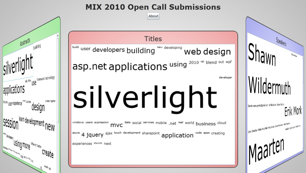
I was digging through all the sessions submitted for the MIX10 Open Call last week and I decided that there had to be a better way to browse through the data to find sessions that might be interesting. So I spent the weekend hacking together this Silverlight visualization of the MIX10 Open Call sessions.
If you think this is an engaging way to look at the Open Call sessions, I ask that you include my session “Creating Effective Info Viz in Silverlight” on your ballot.
If you have any problems with this project, please let me know! I’ve already had one person point out a parsing error that was depriving him of a properly attributed session.
This visualization is basically a set of word clouds for the titles, abstracts and speakers of the submitted proposals. Clicking on the words or names brings up a list of related sessions with links so that users can either go to the session or directly vote for it (although you’d still need to click “Submit Your Ballot” in order to make the vote count).
So, now I’d like to talk about problems with this project.
There’s a weird problem with the animation when the panels flip from front (the word cloud) to back (the detail view). I think this is because I’m building the detail view dynamically, which makes it mostly a performance issue. I spent a couple hours fighting with this problem and tried several possible solutions. Ultimately, I couldn’t fix it, so I decided not to let the perfect be the enemy of the good.
I decided to use a wrapping ListBox for displaying all the words and names rather than try to squish them onto a single screen for a couple reasons.
- Dumping all the sized items into a ListBox was WAY easier that constructing a beautiful Wordle type word cloud and gave me most of the value. Since there was a very short window in which this project would be valuable, I decided in favor of the faster method.
- If the user is trying to play around with this and doesn’t want their browser to fill the screen, they can still see everything. Allowing scrolling means that the user doesn’t have to feel like I DEMAND their full attention. The application becomes a casual application rather than a consuming one.
- People love to see their names in lights. Over on the “Speaker” section, I wanted the names to be big enough so that every person who submitted a session could see their name in the “Speaker” panel. That was probably the most important part of this project to me (hey, I do user design… it’s all about the people), so that’s what I did.
Given more time, I probably would have worked a little more on the visual design and the motion design (animations and what not). I probably also would have sped up the application by taking some of the processing procedures out of the application and turned them into static data files. The fact of the matter was that this project evolved from testing to prototype to final project very quickly because of the time constraints.
But, hey, that’s life.
