If you want to know more about any particular topic, make sure you watch the videos over at Microsoft Virtual Academy. The slides are also available there.
Summaries for:
07 – Pen and Ink (11 minutes)
Summary: Pens and inking are an pretty cool aspect of Windows 10, especially as they work in a cross-device way. Unfortunately, there wasn’t an enormous amount of information here. Inking looks much improved from Windows 8.1, with a discussion about how developers can take inking and add metadata, convert it into text or shapes, but very little in terms of details.
Code: A short demo starts at 8:00. Jerry adds an InkCanvas control to a project and shows how it works very easily.
08 – RelativePanel Control (20 minutes)
Summary: The RelativePanel control is a layout control that looks like it is meant to replace the Grid as the “go-to” control for XAML-based applications. It responds well with the trigger system to create UIs that have powerful adaptive abilities.
The key to RelativePanel is that it offers alignments with either the center or the edge of… something. The way to align is to place the control within a RelativePanel and then assign an attached property to it that will tell it what layout to use. Objects can be aligned within the context of the panel or aligned with another control in the panel.
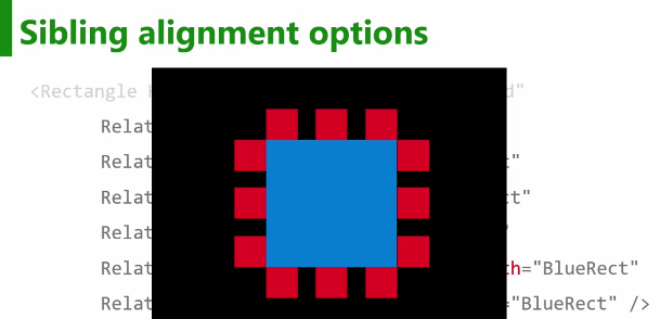
In the above example, the red squares at aligned to the blue rectangle by setting the horizontal or vertical alignments of the red squared to the top, bottom, left, right, or center of the blue rectangle which is itself aligned to the center of the panel. If you want to see more of this code in detail, start at 7:30.
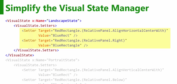
Additionally, the RelativePanel makes adaptive UIs simpler because developers can change the alignments using the Visual State Manager.
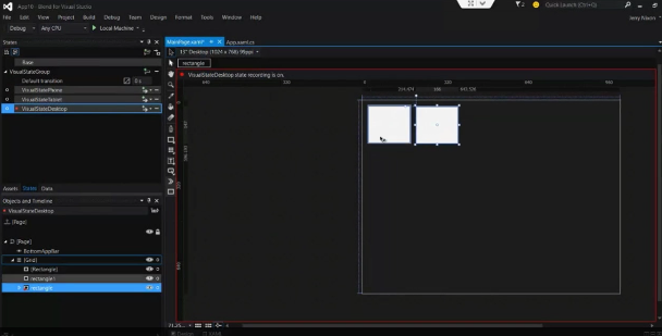
Code: Starting at 12:30, there is a good demo from Jerry in which he adds a RelativePanel to a project and uses the Blend tooling to manage the triggers and states.
Here’s a code example of using RelativePanel:
<RelativePanel>
   <!-- Align a red rectangle with the center of the panel -->
   <Rectangle x:Name="RedRect" Height="100" Width="100" Fill = "Red"
      RelativePanel.AlignHorizontalCenterWithPanel="True"
      RelativePanel.AlignVerticalCenterWithPanel="True" />
   <!-- Align a blue rectangle with the bottom right of the red rectangle -->
   <Rectangle x:Name="BlueRect" Height="50" Width="50" Fill = "Blue"
      RelativePanel.Below="RedRect"
      RelativePanel.AlignRightWith="RedRect" />
</RelativePanel>
And if you wanted the blue rectangle to align to the left of the red rectangle when the screen is thinner…
<VisualState x:Name="ThinState">
   <VisualState.Setters>
      <Setter Target="BlueRect.(RelativePanel.AlignLeftWith)"
         Value="RedRect" />
   </VisualState.Setters>
   <VisualState.StateTriggers>
      <AdaptiveTrigger MinWindowWidth="500" />
   <VisualState.StateTriggers>
</VisualState>
Appropriate sibling alignment properties include: Above, Below, RightOf, LeftOf, AlignTopWith, AlignBottomWith, AlignRightWith, AlignLeftWith, AlignHorizontalCenterWith, AlignVerticalCenterWith
09 – Adaptive Trigger (15 minutes)
Summary: Adaptive triggers are triggers in the Visual State Manager that developers can use to define how a layout changes depending on (you guessed it!) the visual state. The official recommendation is to manage the visual states based on the screen size. However, as Morten Nielsen demonstrated, you can use visual states to define screen layout for platforms using the PlatformAdaptiveTrigger.
The major benefit of adaptive triggers is the ability to change the UI and layout without any code changes (which is pretty damn cool).
Code: There is a demo from 9:00 – 13:00. Jerry opens a project, opens the XAML file and starts working with the visual state panel on the left of the Blend UI. Shows “Phone” “tablet” and “desktop” visuals. He starts with phone (MinWindowWidth=”0″) and then adds states for widths of 600 and 800.
The example of an adaptive trigger in the RelativePanel section is pretty much identical to what you would see here.