App bars in Windows Phone 7 are actually a pretty cool little bit of functionality. They give the user 1-4 instantly accessible options for dealing with the screen the user is on, their buttons auto-animate in, they offer “always on” funtionality that isn’t going to be hidden by the on-screen keyboard, they give designers and developers instant access to a range of default icons in Windows Phone 7 ecosystem and they offer a much wider range of options when the user taps on the ellipses to open more options.
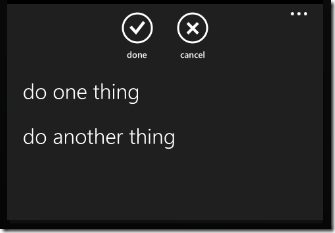
That’s a lot for such a little thing item. So you may be asking yourself, “What the hell is he talking about? What is an ‘App Bar’?” This:
And like this when the ellipses are tapped
But what gets me is the fact that making these things is so damn easy, thanks to the fact that Blend is the single greatest product ever created for people who want to design user interfaces. And you can quote me on that. My crush on the Microsoft Blend team is well documented.
Anyway.
So let’s go about mak
Making the App Bar
ing this app bar. You may be surprised to know that we can do pretty much everything we need to do without a single line of code. Because Blend is so stinking awesome.
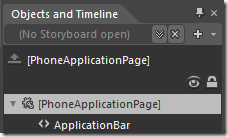
First, select the PhoneApplicationPage in your Object and Timeline tab in Blend.
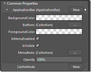
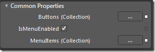
In the “Common Properties” section, you’ll see an “ApplicationBar” property. Click on the “New” button. You should see the following:
Add App Bar Buttons
Click on the “…” button to the right of “Buttons (Collection)”. Up will pop a “Collection Editor: Buttons” pop-up. Click on the “Add another item” button.
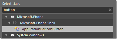
Type “Button” and you should see a “ApplicationBarIconButton” option.
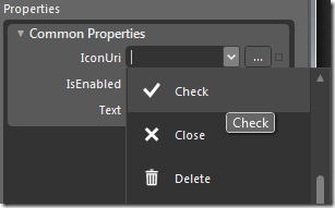
Double-click on it. It will add an App bar button to your app bar. You should have a set of “Common Properties” that you can set. Type in the text you want (in our case, “done”) and click on the IconUri box. You will see a list of default Windows Phone 7 icons. Pick the one that works for you (I picked the check mark).
Do that same thing over again, but pick the close icon and give it the text “close”. Hit “OK” to close the app bar pop-up. Believe it or not, we’re done. Yeah, we need to hook up some Click events so they can actually do something, but the rest of it is all taken care of.
If you need to get back to the App Bar design, you can just click on the ApplicationBar in the “Objects and Timeline” and see the options again.
Add App Bar Menu Items
Adding menu items is similarly easy. Under the “Buttons (Collection)” item we clicked on earlier, there is a “MenuItems (Colleciton)” button. Click on it.
We see the same “Collection Editor and we’ll click “Add another item” again. This time, though, we type “menu” and double click on ApplicationBarMenuItem.
Add the text (“do one thing”) and run the process again to add another item. Click “OK” when you’re done.
Colors & the Application Bar
Designing the App Bar is pretty easy. The icons that we assigned to the buttons actually just act as opacity masks (I assume that’s how it works… it seems to make sense) so that they will change to whatever color is assigned to the foreground of the app bar. Warning: they will default to the theme foreground unless you explicitly set them to be another color. If you’ve decided not to work with the default theming engine, you will need to explicitly set the foreground and the background of the App Bar.
I talk about this a little bit more in my post on Windows Phone 7 theming. That might be a good place to go if you’re working on fine-tuning the app bar to fit into a non-themed design.

