If you’re interested in government transparency, there is not better organization to watch than the Sunlight Foundation, a non-profit organization that is leading the charge to more government transparency through the release, organization and visualization of government data and processes.
Every once in a while, Sunlight Foundation runs contests to either visualize or interact with government data. I submitted a Silverlight project called “Recovery Review” for the latest contest, “Design for America”. With Recovery Review, users can search and visualize stimulus projects. If they find information that they think is inaccurate, they can flag that project for inaccurate information.
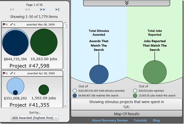
The idea behind the visualization is that users can search through the data using a couple of key points (how much money was awarded to a project, where the project is, how many jobs were reported as “saved or created” due to the project, etc) and the system will deliver in a visual format a set of results that match that search. It will also visualize (as seen above) the total of all awards that match that search in the context of the stimulus awarded as a whole.
If the user clicks on the on one of the projects in the list, the visualization resizes so the user can see how much money and how many jobs that individual project represents, both in relation to the search total and in relation to the total stimulus.
Here’s a video overview of the project (runs about 8 mins).
And here is a blog post for the project that discusses some of the design decisions made and what I would change given more time.
Looking at the competition, I find it unlikely that I will win, but building the project was a pretty exciting learning experience. I’ll be posting my lessons here in the next couple weeks.

![clip_image001[14] clip_image001[14]](https://matthiasshapiro.com/wp-content/uploads/2010/05/clip_image00114_thumb.png)