So you’ve got a listview and you want the columns (not the rows) to look a certain way. (If you are in any way confused, head over here.)
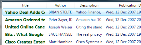
In this post, we’re going to build a template for a column and style that template so the data in that column is all styled the same way, but different from the data in the rest of the list view. Kind of like this:
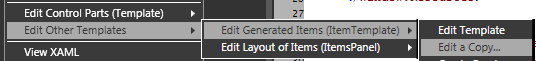
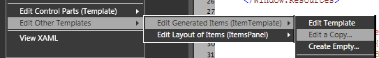
If you’re following from the RSS Feed post: go to the listview in the main composition and right click on your listivew and go to “Edit Other Templates -> Edit Generated Item (ItemTemplate) -> Edit a Copy…”
Not following from the RSS Feed post: go to the listview in your composition, right click on your listview and co to “Edit Other Templates -> Edit Generated Item (ItemTempalte) -> Create Empty…”
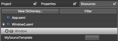
Name it whatever you like (I named mine “TitleTemplate”) and hit OK.
RSS: If you had a template Blend will create a copy of your original source template with all the bindings in place. Get rid of all the bindings you don’t want. I think the easiest way is to simply go into the XAML and do this. Right click on any item and click the “View XAML” and delete any binding that doesn’t have “title” in it. When we’re done, your XAML should look like this:
<DataTemplate x:Key=”TitleTemplate“>
<StackPanel>
<TextBlock Text=”{Binding Mode=OneWay, XPath=title}“ />
</StackPanel>
</DataTemplate>
Not RSS: Blend will create the basic DataTemplate markup for you and toss you into a DataTemplate editing mode.
From here, you can draw a Grid directly into the composition and a TextBlock directly into the Grid. Reset the Width and Height of the Grid and TextBlock to Auto and reset the Margins to “0,0,0,0”. Assign the TextBlock the proper Bindings in order to get it to show the proper data. Your XAML should look something like this.
<DataTemplate x:Key=”TitleTemplate“>
<Grid>
<TextBlock Text=”{Binding MySpecialBindings}“ />
</Grid>
</DataTemplate>
From here we can style the TextBlock directly in the DataTemplate using the Properties panel. Bold it, color it, skew it, turn it upsidedown, give it TextTrimming or TextWrapping or whatever we want. When finished, head back to the main composition view.
Click on the listview and, in the Properties section, expand “Miscellaneous” and then expand “View (GridView)” and click on the “Columns (Collection)” button.
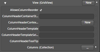
Up pops the “GridViewColumn Collection Editor: Columns” window (which should be labeled something less obfuscating like “ListView Column Editor”).
Here we can create columns to aptly aid our evil schemes. If you’re following along from my RSS tutorial, we can create three new columns using the “Add Another Item” button (which should be labeled “Add Another Column”) and give them the following headers using the Header input in the Properties section:
“Title”
“Author”
“Description”
“Publication Date”
If we want all our data to look the same with basic text elements and no fancy stuff, we can use DisplayMemberBinding and check out my post on that (coming soon).
However, if we want the special styling applied, we can choose the particular GridViewColumn to be specially styled and apply the template we’ve created.
(I feel like I’m writing a choose-your-own-adventure here. “If you want Johnny to answer the doorbell, turn to page 57. If you want Johnny to escape out the window, turn to page 23.”)
Anyway.
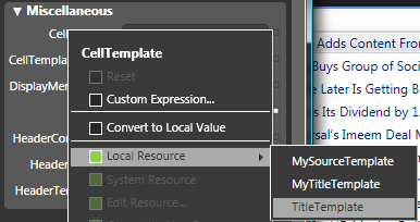
Click on the GridViewColumn with the “Title” header and click the little box to the right of “CellTemplate” In the resulting menu click on “Local Resource” and select the DataTemplate that we’ve just created. Click “OK”.
And viola! Our listview shows up all sorts of custom designed happiness.
ListView Frequently Asked Questions pertaining to ColumnHeader issues:
How do I make it so that, instead of cutting off the text in my column when I shorten it, my text displays ellipsis? (Example: “blahblahb…”)
which is closely related to:
How do I make it so that my text wraps when I shorten my columns?
So I deal with them in the same post here.
My binding points to an image source. How do I make it so that the image it points to shows up in the column instead of the stupid image source? (coming soon)
How do I center something in my ListView column?