Mac Scroller Project Files Updated for RCW
Just because we’re working in Microsoft technologies doesn’t mean we can’t throw a bone to our Mac friends. After all, they are the people we love, our cousins and our neighbors, and that irritating guy who is dating our daughter and can’t seem to shut up about how awesome his Mac is even though he’ll be long out of his program in musical costume design before he ever pays off his laptop …
Issues? I don’t have issues. Why do you ask?
Anyway, since Silverlight is a semi-ubiquitous technology, it would be nice if we could cater to all platforms and not make anyone feel left out. And nothing makes people feel more left out than when they expect their application to work one way and it doesn’t.
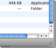
So, here’s a picture of what we’re going for.
As far as I’m concerned (and therefore as far as this tutorial is concerned) the important stuff is to make sure that the incremental buttons (the arrow buttons in the bottom right) are in the right place. We can deal with the color later.
OK, so let create our ScrollViewer (I’ll be using Blend exclusively for this). I tossed a button in it and made it small so we can see both of the ScrollBars.
Right click on the ScrollViewer in the “Objects and Timeline” section and go down to “Edit Control Parts (Template) -> Edit a Copy…”
You should have something that looks like this:
Let’s do the VerticalScrollBar first. Right click on it and go to “Edit Control Parts (Template) -> Edit a Copy…” Name it something memorable and you should get something like this:
This is actually easier than it looks. The unnamed rectangles and the path lay down the basic visual backbone for the ScrollBar and the rest of it runs like this:
![]()
VerticalSmallDecrease – The up button
VerticalLargeDecrease – The space between the up button and the VerticalThumb
![]()
VerticalThumb – The interface element that allows the dragging interaction of the scrollbar
VerticalLargeIncrease – The space between the down button and the VerticalThumb
![]()
VerticalSmallIncrease – The down button
The horizontal root in this template is strikingly similar.
So, let’s start by moving the VerticalSmallDecrease button down to the bottom above the VerticalSmallIncrease button. The magic here will happen in the VerticalRoot grid. (I highly recommend the Design/XAML split view for this one.) In the design view, our grid looks like this:
Ugly. However, in the XAML, it looks like this:
<Grid.RowDefinitions>
<RowDefinition Height=”Auto”/>
<RowDefinition Height=”Auto”/>
<RowDefinition Height=”Auto”/>
<RowDefinition Height=”*”/>
<RowDefinition Height=”Auto”/>
</Grid.RowDefinitions>
<Grid.ColumnDefinitions>
<ColumnDefinition/>
<ColumnDefinition/>
</Grid.ColumnDefinitions>
Much easier. For the purposes of maintaining a coherent structure, drag the VerticalSmallDecrease in Objects and Timeline pane until it is between the VerticalSmallIncrease and the VerticalLargeIncrease. Next, change the third RowDefinition to “*”. You can do this in the XAML or by clicking on the “Auto” icon![]() until it becomes a “*” icon.
until it becomes a “*” icon. ![]() Change the fourth RowDefinition from “*” to “Auto”. When you do this, it won’t immediately act like an “Auto”. This is because Blend gives it an automatic “MinHeight” of whatever the current Height is. You can change that in the XAML (easiest move) or you can highlight that row by clicking just below the “Auto” icon until the row highlights in a semitransparent gray like so.
Change the fourth RowDefinition from “*” to “Auto”. When you do this, it won’t immediately act like an “Auto”. This is because Blend gives it an automatic “MinHeight” of whatever the current Height is. You can change that in the XAML (easiest move) or you can highlight that row by clicking just below the “Auto” icon until the row highlights in a semitransparent gray like so.
You may need to zoom in to do this. Once highlighted, the properties of the Row will show up in the Properties tab on the right. Change the MinHeight to 0.
Now we’ll need to change the Grid.Row properties of almost everything. Click on the items in the Objects and Timeline and change the Row property in the Layout section of the Properties tab like so:
VerticalLargeDecrease -> Row = 0
VerticalThumb -> Row = 1
VerticalLargeIncrease -> Row = 2
VerticalSmallDecrease -> Row = 3
VerticalSmallIncrease -> Row = 4
You’re done. With the Vertical part of the ScrollBar at least. You can do the same thing with the Horizontal part of it. Just move around the buttons, change the ColumnDefinitions and update the Column assignments. My best recommendation is to go back to the ScrollViewer template and assign your new ScrollBar template to the HorizontalScrollBar and then go back to editing the template from there.
Later on…
After a bunch of color tweaking, I have a scroll viewer in silverlight that looks like this:
I’m feeling OK with it. I’ve embedded what I have at this point below.

![clip_image001[4]](https://matthiasshapiro.com/wp-content/uploads/2008/08/clip-image0014-thumb.png)
![clip_image001[6]](https://matthiasshapiro.com/wp-content/uploads/2008/08/clip-image0016-thumb.png)
![clip_image001[8]](https://matthiasshapiro.com/wp-content/uploads/2008/08/clip-image0018-thumb.png)
![clip_image001[12]](https://matthiasshapiro.com/wp-content/uploads/2008/08/clip-image00112-thumb1.png)
![clip_image001[20]](https://matthiasshapiro.com/wp-content/uploads/2008/08/clip-image00120-thumb1.png)
![clip_image001[28]](https://matthiasshapiro.com/wp-content/uploads/2008/08/clip-image00128-thumb1.png)
![clip_image001[32]](https://matthiasshapiro.com/wp-content/uploads/2008/08/clip-image00132-thumb.png)
![clip_image001[34]](https://matthiasshapiro.com/wp-content/uploads/2008/08/clip-image00134-thumb.png)