This tutorial derives from the general “How to Style the ComboBox” set of tutorials.
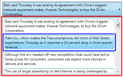
First let’s make sure you’re in the right place. In this tutorial, we’re going to style the comboBox drop down (also known as the ComboBox popup) seen highlighted in red below.

We will not be styling the items inside the dropdown (highlighted in blue). You can learn how to do that here.
So… let’s just go after some of the basics in styling the dropdown. We’ll give it a new background, a new border and we’ll round the edges to make it just a little more bubbly.
To start out, we’ll need to get to our comboBox control template, so right click on the comboBox in the Objects and Timeline window and go to “Edit Control Parts (Template) -> Edit a Copy…”

Name it something you like and we’re on our way.
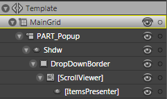
We’ll be editing the PART_Popup. Whatever you do, don’t change the name to this sucker. Whenever you see a “PART_Something”, it is a necessary part of that specific control (hence the naming convention).
The ComboBox dropdown (which we’ll be calling a popup for the remainder of this post) is made up of a low cost drop shadow (see more on that here), a border, a scrollviewer and the itemsPresenter.

Most of the standard styling we might want to do is probably going to happen in the Border titled DropDownBorder. We can alter the background and the border brushes easily enough by just changing them in the Properties window. But you may notice some quirky behavior from our scrollviewer when we change the CornerRadius. Below, I’ve changed the CornerRadius to “0,0,10,10” and we can see that we lose part of the corner under the scrollviewer.


We can solve this easily enough by adding some padding through the Border. Below I’ve added a padding of “0,0,2,6“.

Better, but not really ideal. In a perfect world, we would be able to say that the border us able to cut off its content in that nice pretty rounded manner. (If anyone knows how to do that… let me know, I haven’t given it hours of thought yet, but I’d love to know). In this case, however, this sub-optimization is the price we’re going to have to pay if we don’t want to have to go in and mess with the scrollbar style and template.