One of the most frustrating things about developing for Windows Phone 7 has been the experience with the application approval process. To illustrate the problems my team is having, let us demonstrate with a theoretical sample application.
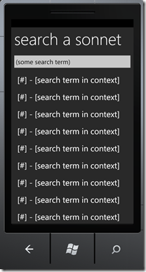
Let’s say we want an application for reading all of Shakespeare’s sonnets. There are 154 of them, so we’ll want to break them out, maybe one per screen, allow the user to read them sequentially or jump to a particular sonnet. Maybe we want to be able to search through the sonnets too, just a nice easy way of navigating to that one line we can remember.
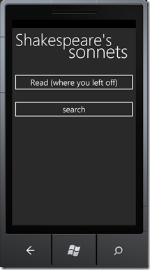
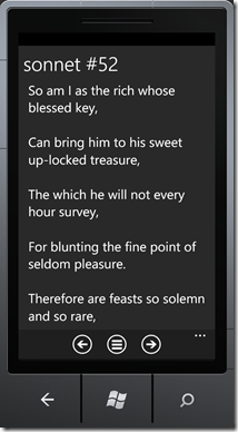
Let’s say we have a design that looks something like this (opening page on the left, reading page on the right):
We want the sonnets to be front and center in this app, so we take up the whole screen with them. The buttons at the bottom facilitate a very normal “next sonnet”, “previous sonnet” paradigm for navigating the sonnets. Think of them as discreet chucks of reading material. They’re small enough that it doesn’t make any sense to break them up into a page-by-page groupings (like with the Amazon Kindle apps).
Because of the specific needs of our user, we decide that we want the “back” hardware button to go back to the main page instead of cycling back through the sonnets. Our reasoning is that the user could be reading 10-20 sonnets at a time and we don’t want them to have to back out to the main page with 20 “back” presses.
That’s all well and good until we try to submit out application and we get the following error report.
“Pressing the Back button must return the application to the previous page.”
But in our paradigm, it does. The “reading a sonnet” is one page and the “home page” is another page. For our specific application’s needs, it does what needs to be done. Changing it to pass the Microsoft application process would break our user experience. The situation I described above (reading 20 sonnets in a sitting) would result in the following interaction to get back to the home page:
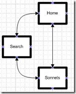
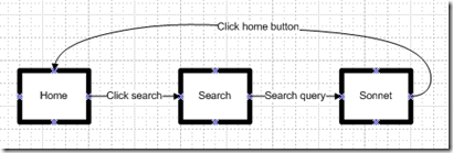
You may object and say “Why don’t you just put a ‘home’ button in the reading pane?” That, my friend is a fantastic idea. And we would totally do that if it didn’t add the home page to the back-stack. Our navigation scheme looks a little like this:
If we navigate to the home page via a button, we have two choices. We can only do one of the following:
- the button can simulate a “back” press
- the button can use a navigation service and point to the “home” page
Doing the first isn’t an option because, if we got to the sonnet via a search, we would go back to the search page instead of the home page. An inconsistent navigation interaction. Rejected. (And, worse than that, it’s horrible UX.)
However, the second isn’t an option either because if we navigate to the home page, the app will stick the home page into the back stack so that the following interaction:
Results in the following back-stack:
With this back-stack, pressing “back” from the home page would take us to the reader so that we fail another one of the Microsoft user guidelines (pressing “back” at the home page MUST take the user out of the application). We have no way of accessing the back-stack and we can’t programmatically exit the application.
The result? We have no choices. Damned if we do, damned if we don’t.
We have taken a 3 page application that would take less time to create than I’ve spent writing this blog post (and that some people would really like to have) and backed ourselves into a corner due to nothing more than Microsoft’s UX back-stack approval regulations.
We’ll have to build this incredibly simple application a totally different way. A way, I should note, that will confuse the user and complicate something that should extremely easy.
My point here is simple and larger than the issues with the back-stack:
You cannot strictly enforce a specific user experience across all user possibilities.
Each application should know its own users. Each application needs to be able to create a user experience that is specific to its users’ needs . Otherwise, this process will stifle creativity and sap energy. Imagination will fly out the window (pun intended) as the app will be unable to pass the UX guidelines. And users will be poorer for it.
Some of the Microsoft UX acceptance guidelines make sense. I understand the need for some degree of uniformity in the Windows Phone 7 ecosystem and I’m all for spiking an application that has inconsistent or broken navigation. But I’m working with clients who are getting pretty upset because we made some very common-sense UX decisions that are being spiked by the Microsoft application acceptance process.
Humbly, I propose the following:
- Get rid of most of the onerous back button requirements. – Sure, require that the application provide a consistent “back” experience throughout the application. But outside of that, let the UX designers do their jobs.
- Allow access to the back-stack. – We’ve run into a set of extremely frustrating scenarios where the user ABSOLUTELY NEEDS to use an application a certain way, but doing so messes up the back-stack so that the back button functionality doesn’t allow the app to pass.
- Allow the developer to exit the application. – I’ve seen developers hamstrung with situations like this that could have been simply solved if only they were allowed to exit their own applications.
- Lighten the hell up. – I’m going to speak plainly, Microsoft, and it’s because I love you. You are not Apple. Apple attracted some people who were willing to put up with their approval BS for a long time because they loved the iPhone. And because they were early to the game, they weren’t losing devs to other platforms. Although, you may note, I think they did end up losing devs to Android over time in no small part because Android basically doesn’t want their apps to crash. Outside of that, they let the market decide what is worth keeping and what isn’t.
Regarding the issue of winning over mobile developers, I want to make this as clear as possible:
Windows Phone 7 is, as we speak, losing fantastic applications because of its approval process.
I can’t overestimate how frustrated my clients are with the Microsoft approval process. It ranges from sadness to fury. Clients who are on virtually all other platforms are expressing frustration that they have never had so much trouble getting through an approval process. The rejection reports are inconsistent, spotty, and fragmented. We will submit an app 5 times and get different “errors” back each time. Nine times out of ten, those errors are not errors, but complaints about UX functionality. Of those, at least half of them are complaints about functionality that, if fixed, would worsen the user experience.
I love Microsoft and I love Windows Phone 7, but rejecting apps based on the UX guidelines (while not giving us the tools to abide by the guidelines effectively) is a recipe for suicide.
