This is actually a continuation of my post on getting the ComboBox items to accept text wrapping, so I’ll be working from that point forward. If you’re coming fresh into this, you won’t be missing anything… but that is my explaination for the pictures containing wrapping text.
When last we left our heroes, we has a couple problems. The first was that our items were either black text on a white background and ran together in a very un-designer-y way.

The second was that the selected item background makes your eyes bleed such a horrid blue color you’ll feel like Paul Atreides staring at a stone burner.
Was that a little too geek? My apologies.
Anyway, let’s do something to make this control a little more usable (as well as easier on our eyes).
Highlight your ComboBox and go up to the toolbar, selecting Object -> Edit Other Styles -> Edit ItemContainerStyle -> Edit a Copy…

We’re now in the ItemContainerStyle editing mode. I really just need some demarcation between the items, so I’m going to give the items a BorderBush with a gradient that has a nice blue at the top and fades down to transparency at the bottom. It looks something like this:

We will, of course, want our users to see this border, so let’s give the style a BorderThickness of 1 all around and a Margin of 4 to offer a little space. Our items now look like this:

Better… but we don’t see the trigger for that hideous shade of blue in the style, so we need to go somewhere else to change it. Right click on the Style and go to Edit ControlParts (Template) -> Edit Template

We can see that the template here is exceedingly dull… just a border surrounding a ContentPresenter. We like dull. Dull means it’s not complex. First, let’s do some polishing up… give that border a CornerRadius of 5. Keep in mind that this is Vista-based development… no sharp corners allowed.
Now, let’s kill that blue. Click on the “IsHighlighted = True” trigger at the top…

..and we can see the highlighted state. I changed the Background to a nice soft blue gradient (you can change it to a deep purple with a green bubble for all I care… it’s WPF, go nuts!) This would be great except that I can’t see the Foreground now, so let’s change that to make the text readable.
I couldn’t figure out how to do this in the design mode, so find the IsHighlighted Trigger in the XAML and insert the bold text below:
<Trigger Property=”IsHighlighted” Value=”true“>
<Setter Property=”Foreground” Value=”#FF001720“/>
<Setter Property=”Background” TargetName=”Bd“>
…
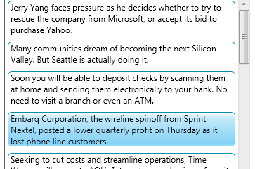
Now our ComboBox items look like this:

Much better.