I had a question from a reader in an earlier post on how to resize the ListView Gripper (seen below) so I wanted to address that in this quick post.

Styling the gripper is actually pretty easy. First, take a look at my Styling the ListView Column Header post. Follow that along until you get to the template for the ColumnHeader (by the fifth image down).
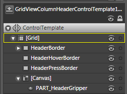
You should have something that looks like this:

Now we’re going to ignore everything here except that little part at the bottom the “PART_HeaderGripper”
A point of note: Perhaps I’ll go over this more some day, but we’ll just mention it in passing:
Do NOT change the name of that thing.
When you see something in a template with the prefix “PART”… Well, Robby Ingebretsen talks about it here:
“PART_” is just a naming convention. It means that the control expects an element with that name to exist in the template and will be looking for it. Think of it as a way to flag that element as important and an indication that the name shouldn’t change. The control could be looking for that element for a variety of reasons.
So this gripper is essential to the proper functionality of the column header.
But that doesn’t mean we can’t futz with it right?
The thing about the gripper is that its parent template (the GridViewColumnHeader template) holds all the triggers that control the IsMouseOver and IsPressed state. If you want to alter those, make sure that you either:
- Do it in the GridViewColumnHeader template (just change the triggers as they currently are)
- Get rid of the triggers in the GridViewColumnHeader template so they don’t interfere with your own triggers.
The difference of course is that if you use the second option, your gripper will only perform the triggers when the user is directly over the gripper itself while in the first option, the triggers will fire off when the user is over any part of the column header. The user design side of me loves the second option because it is a much clearer indication to the user that they are about to do something with the gripper itself.
Besides, when I decide to mess with the gripper, I’m usually doing a major overhaul of the thing. So lets go into the guts of the gripper by right clicking on the gripper in the Object and go to:
Edit Control Parts (Template) -> Edit Template

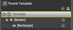
The Gripper is a “Thumb” control. You can also see more examples of Thumb controls acting as the scrollbars in the ScrollViewer template. Unlike the ScrollViewer, this Thumb control is the most boring template you’ve ever seen… it’s Border with a Rectangle in it.

But boring is good because we can go in and change everything we need really easily. The rectangle is the piece you can see and the border defines the clickable area. From here, you could make the gripper a smiley face if you wanted.
Such is the power of WPF…