So… you’ve got your listview and you want your items to look a certain way. In this post, we’ll look at changing as many things as we can inside the ListView ItemContainerStyle.
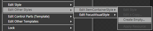
First things first… getting to the ItemContainerStyle using Blend. With the ListView selected, go to the top menu and click:
Edit Other Styles -> Edit ItemContainerStyle -> Create Empty…
Name your Style and you get tossed into Style editing. Here, you can do all sorts of great things, like… um… changing the background or something.
OK, I’ll fess up, I’ve found the ItemContainerStyle to be good for the following things (and not too much else):
- Giving your items a nice border.
- Changing up and down margins (how far apart your items are from one another)
- Changing the HorizontalContentAlignment (like in this post on centering items in a column)
- Changing the VerticalContentAlignment (if you have a thick item, you can get your data to align to the top or center or whatever)
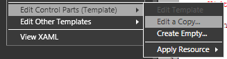
However, in order to get to the real fun stuff with ListView items, we want to go into the ItemContainerStyle template. So right-click on the “ItemContainerStyle” in your “Objects and Timeline” panel and go to:
Edit Control Parts (Template) -> Edit a Copy…
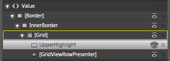
And now you have a copy of your default ListViewItemTemplate. If you want a good example of how a lookless control is constructed, head here. You’ll see how they use split grids and transparent gradients to get a look that maintains it’s feel even when the base background is changed. I’m working inside Vista, so this is what the visual tree of my ListViewItemTemplate looks like:
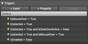
But if you’re like me, what is interesting about this particular template is not the visual tree… it is the triggers that the template hands to you. Lets look at these triggers one by one.
(If you don’t know where the triggers are, they’re above the Objects and Timeline pane and they look like this:
Clicking on a trigger will give you a preview of what that trigger looks like and will also allow you to change the properties of anything inside the template that will implement when the trigger is active.
You can put these same triggers into your ItemContainerStyle and, as a general rule, I would recommend it. As a general rule, I would recommend putting as much into the style and staying out of the template for the sake of simplicity. However, the style does have some pretty significant limitations, especially in this case. So, for the meantime, we’re just going to futz with it as it has been given to us.)
IsMouseOver = True
Kind of obvious what this does.
IsSelected = True
Again, kind of self-explanitory. When an item is selected, this is what you get.
IsSelected = True and IsSelectionActive = False
This is the default state of the first item in your listview before you’ve done anything to it. I have to admit, it took me quite some time to figure that out. The designers I was working with thought this style would confuse users and so we got rid of it. If you want to get rid of it, just delete this trigger and you’re golden.
IsSelected = True and IsMouseOver = True
In this example, it is subltly different than the IsMouseOver alone, but you can see the difference.
IsEnabled = False

I vaugely recall working on a project in which I tried to get individual items to unenable and I vaugely recall it not working very well. It could be because I was trying to do it in XAML, but the example you’re seeing here is when the entire ListView has IsEnabled set to “False”
A couple of suggestion for getting a good feel of the ItemContainerStyle triggers:
- change the background when the user selects an item
- change the height when the user selects AND mouses over an item.
- change the visibility to “Collapsed” when the user mouses over an item. (This one is sure to make your users roll on the floor with laughter… shortly before they come after you with torch and pitchfork in hand.)
All of these triggers are property triggers, so they are not (as they stand) suitible for triggering any animations. If you’re interested in seeing animations in your ListView items, check out this post (coming soon).
If you’re more interested in what you can do with triggers, check out this post (coming soon).
If you’d like to have that nifty “every-other-item-is-gray” thing going on, here’s a post for you while I try to whip up something of my own.
Please sound off with any more comments if you have additional questions.