ListView header Styling is one of the most difficult styling pieces I’ve had to deal with. Part of this is because it is just another part of the seemingly endlessly complex listview. The other part is just because of the way the styling for the listview is put together in WPF.
In this post, we’re going to change the default color of the header (background and foreground) and make the headers look more like bubbles. Why? Because we can! (Everytime I say that, somewhere a usability expert loses a little bit of their soul.)
Take note that anything done in this will affect the whole header. If you’re looking to do something to one individual column in the header, you need to go to this post on ColumnHeaders (coming soon). See the bottom of this post for more details.
As a point of note, the easy way in this particular case involves going directly into the XAML and the hard way involves going through the steps in Blend. The easy way is posted at the bottom.
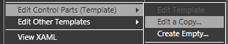
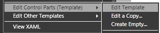
Now for the hard way. First, go to your listview, right click on it and go to:
Edit Control Parts (Template) -> Edit a Copy…
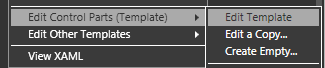
You’ll be given the basic template of your listview. Right-click on the scrollviewer and go to:
Edit Control Parts (Template) -> Edit Template
You’ll be given the default scrollViewer template for the specialized scrollViewer used in the ListView. In addition to the normal scrollviewer parts, it has a control that acts as the holder for the header called the “GridViewHeaderRowPresenter”.
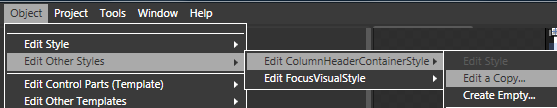
Highlight the GridViewHeaderRowPresenter (which I am renaming “steve” so I don’t have to write that anymore) and, in the menu, go to:
Object -> Edit Other Styles -> Edit ColumnHeaderContainerStyle -> Edit a Copy…
This is where we are going to want to change the foreground and background.
Go over to the Properties panel to the right and click on foreground, giving it a solid color brush (I’m going to use a dark blue). Do the same thing with the background (light blue)and the BorderBrush (blue gradient) (you’ll see why in a moment).
Now my style looks like this in the XAML:
<Style x:Key=”CustomHeaderStyle” TargetType=”{x:Type GridViewColumnHeader}“>
<Setter Property=”Background” Value=”#FFCDE7F4” />
<Setter Property=”Foreground” Value=”#FF07034B“/>
<Setter Property=”BorderBrush“>
<Setter.Value>
<LinearGradientBrush EndPoint=”0.5,1” StartPoint=”0.5,0“>
<GradientStop Color=”#FFA1CCE0” Offset=”0“/>
<GradientStop Color=”#FFABD5EA” Offset=”1.0“/>
</LinearGradientBrush>
</Setter.Value>
</Setter>
<Setter Property=”Template“>
…
</Style>
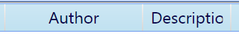
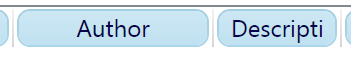
and my column headers look like this in the composition (zoomed in to 200%):
But wait… there’s more. Right click on your ColumnHeaderContainerStyle in the Objects and Timeline panel and select:
Edit Control Parts (Template) -> Edit Template…
Finally, we are in the real guts of the header template, which means we have all the bits and pieces to make it work.
Note: I’ve recently had a comment on how to style the header gripper (the part of the column header that allows you to resize the column), but this post is already getting way too long, so I deal with it in this post over here (coming soon).
OK, so now we can really get at the look of this sucker. If you’re using Vista, you probably have some Borders with names like “UpperHighlight”, “HeaderHoverBorder”, and “HeaderPressBorder”. These are borders that alter the look of the headers when certain triggers are active. We’ll be ignoring them for the sake of simplicity.
(At this point, my readers are saying to themselves, “Simplicity? SIMPLICITY? At what juncture in this entire post have we even approached simplicity.” To which I reply “Hey, don’t kill the messenger.”)
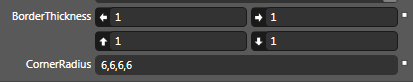
So go to the highest border (in my case, it’s called the “HeaderBorder”) and do the following:
- BorderThickness=”1,1,1,1“
- CornerRadius= “6,6,6,6“
- Margin=”2,0,2,0“

The header now looks like this:
This is the hard way because it uses Blend exclusively without touching the XAML.
The Easy Way
The easy way is also the better way from a XAML perspective. Simply create a create a Style like so:
<Style x:Key=”CustomHeaderStyle” TargetType=”{x:Type GridViewColumnHeader}“>
</Style>
and add it to your ListView like this:
<ListView>
<ListView.View>
<GridView ColumnHeaderContainerStyle=”{DynamicResource CustomHeaderStyle}“>
….
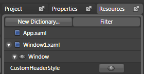
Access it though your resources tab to get to the visual designer interface for your new style:
Once you’ve done this, you can skip directly to the part of the tutorial where you start changing the foreground and background.
Hopefully, at this point you feel like you have a pretty decent handle on the basics of styling your header section. Because it’s getting really late and I’m getting really tired.
But before I go, let’s get one thing absolutely clear: When it comes to ListView headers, you can technically do most of this in the data template, but if you do, you’ll make baby Jesus cry.
Here is why. By doing things as we have done them above, we get the following:

If we do all this work in the data template, we instead get this:

Which brings about the aforementioned consequences. You’ve been warned.
Questions about column headers:
- How do I wrap text in a header?
- How do I make headers sort columns (and how do I style for that)? (coming soon)
- How do I make one header look different than the other headers? (coming soon)