Skip to content

style

How Do I Style The ComboBox Items?

This is actually a continuation of my post on getting the ComboBox items to accept text wrapping, so I’ll be working from that point forward. If you’re coming fresh into this, you won’t be missing anything… but that is my explaination for the pictures containing wrapping text.

When last we left our heroes, we has a couple problems. The first was that our items were either black text on a white background and ran together in a very un-designer-y way.

BeginningViewComboStyling

The second was that the selected item background makes your eyes bleed such a horrid blue color you’ll feel like Paul Atreides staring at a stone burner.

Was that a little too geek? My apologies.

Read More »How Do I Style The ComboBox Items?

The WPF Designers Guide to Styling The ComboBox

 The ComboBox is not the most complex of the WPF applications, but it can be a little tricky, so lets do a general overview post of it before we go into the specifics of how we’re going to make it work.

First of all, if you’re going to test your comboBox design, you should have it hooked up to an ItemsSource. Don’t have one? I have a tutorial in which I walk through attaching an RSS feed to your control. It was originally written for the ListView, but it will work fine for a ComboBox.

To start out… this is your standard ComboBox:
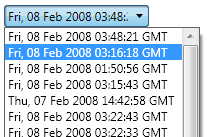
unalteredComboBox

When working on a comboBox, you have a couple of options for the Items inside the ComboBox. If the options never change and are not data-driven, you can just toss come ComboBoxItems into it. Otherwise, you can connect it to some kind of ItemsSource (see the link above).

All of my examples are done with a data-driven ComboBoxes, but you should get the desired results if you run through the tutorials with ComboBoxItems.

First, a little bit about the structure of the comboBox.

Read More »The WPF Designers Guide to Styling The ComboBox

How Do I Wrap Text (or Add TextEllipsis) In The ComboBox?

I’ve been spending the past several days fighting with the ComboBox in an attempt to make it so something very simple: Wrap text inside the combo box. I’ve finally figured it out, so I thought I’d share.

OK, first of all, make sure that your ComboBox is hooked up to something, even if that something is some random RSS feed. I have a post that can help you with that over here. Bind your comboBox to the “Items” part of the New York Times RSS feed.

You need to do this because, if you do not, you will have to set the same data template to every single ComboBoxItem that you add to the ComboBox. And that’s just no fun.

Starting out, your ComboBox should look something like this:

ComboBoxDefault

Right click on your ComboBox and select “Edit Other Templates -> Edit Generated Items (ItemTemplate)-> Create Empty…” Give your new data template a name and Blend will take you into the Data Template design.

Read More »How Do I Wrap Text (or Add TextEllipsis) In The ComboBox?

Embedded ListView Columns (Columns Within Columns)

Please Read: Strangely, when you do a Google search for “wpf” and “listview”, this is one of the top links. This is odd because this particular post is kind of an advanced tutorial. If you’re looking for more general information on styling the wpf listview, check out this post. It is probably much closer to what you’re looking for.

This is a bit of an advanced tutorial. I’m putting it up because I just figured out how to do it and I want to share. You can also download the project files for this tutorial (in zip format… requires .Net 3.5).

Recently, I received from my user experience designers a wireframe that looked something like this:

EmbeddedWireframe

As you can see, there are embedded categories (categories within categories) here. I considered many solutions (hacks), but I found that a deeper understanding of the ListView and how it works would allow me to resolve this issue very simply (and without even touching the code behind).Read More »Embedded ListView Columns (Columns Within Columns)

Styling the ListView Column Header

ListView header Styling is one of the most difficult styling pieces I’ve had to deal with. Part of this is because it is just another part of the seemingly endlessly complex listview. The other part is just because of the way the styling for the listview is put together in WPF.

In this post, we’re going to change the default color of the header (background and foreground) and make the headers look more like bubbles. Why? Because we can! (Everytime I say that, somewhere a usability expert loses a little bit of their soul.)

Take note that anything done in this will affect the whole header. If you’re looking to do something to one individual column in the header, you need to go to this post on ColumnHeaders (coming soon). See the bottom of this post for more details.

As a point of note, the easy way in this particular case involves going directly into the XAML and the hard way involves going through the steps in Blend. The easy way is posted at the bottom.

Now for the hard way. First, go to your listview, right click on it and go to:

Edit Control Parts (Template) -> Edit a Copy…

1_ControlParts
Read More »Styling the ListView Column Header