Skip to content

Blog and Essays

WPF Multi-Point Tutorials, Part 1: Connecting the Wiimote Controller

OK, so I’ve taken note of multi-point WPF a couple times now (both times were in regards to Rick Barraza’s Cynergy demo) and I started noticing that people are really interested in this. So I decided to take some time to create a couple tutorials on creating multi-point interfaces in WPF.

A point of note: I am not a programmer. I am a designer. This means that whatever code I post will probably be a mess. But it also means that if I can make something work in WPF, anyone can.

The first question we need to address is how to pull multi-point interaction data into your system. You could, of course, buy one of these. I don’t have that kind of money, so I decided to try my hand at the poor man’s multi-point: the ever useful Wiimote controller for the Nintendo Wii.

In this post, we’ll go over how exactly to connect your Wii controller to your computer via Bluetooth. (I’m using Vista. Could be different for XP, but I haven’t tried.)

First, open up your Control Panel and double click on “Bluetooth Devices”

Read More »WPF Multi-Point Tutorials, Part 1: Connecting the Wiimote Controller

Embedded ListView Columns (Columns Within Columns)

Please Read: Strangely, when you do a Google search for “wpf” and “listview”, this is one of the top links. This is odd because this particular post is kind of an advanced tutorial. If you’re looking for more general information on styling the wpf listview, check out this post. It is probably much closer to what you’re looking for.

This is a bit of an advanced tutorial. I’m putting it up because I just figured out how to do it and I want to share. You can also download the project files for this tutorial (in zip format… requires .Net 3.5).

Recently, I received from my user experience designers a wireframe that looked something like this:

EmbeddedWireframe

As you can see, there are embedded categories (categories within categories) here. I considered many solutions (hacks), but I found that a deeper understanding of the ListView and how it works would allow me to resolve this issue very simply (and without even touching the code behind).Read More »Embedded ListView Columns (Columns Within Columns)

How do I style the ListView column gripper (also known as a “splitter” or a “seperator”)

I had a question from a reader in an earlier post on how to resize the ListView Gripper (seen below) so I wanted to address that in this quick post.

GripperExample

 Styling the gripper is actually pretty easy. First, take a look at my Styling the ListView Column Header post. Follow that along until you get to the template for the ColumnHeader (by the fifth image down).

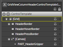
You should have something that looks like this:

Column_Header_Template

Now we’re going to ignore everything here except that little part at the bottom the “PART_HeaderGripper”

Read More »How do I style the ListView column gripper (also known as a “splitter” or a “seperator”)

Styling the ListView Column Header

ListView header Styling is one of the most difficult styling pieces I’ve had to deal with. Part of this is because it is just another part of the seemingly endlessly complex listview. The other part is just because of the way the styling for the listview is put together in WPF.

In this post, we’re going to change the default color of the header (background and foreground) and make the headers look more like bubbles. Why? Because we can! (Everytime I say that, somewhere a usability expert loses a little bit of their soul.)

Take note that anything done in this will affect the whole header. If you’re looking to do something to one individual column in the header, you need to go to this post on ColumnHeaders (coming soon). See the bottom of this post for more details.

As a point of note, the easy way in this particular case involves going directly into the XAML and the hard way involves going through the steps in Blend. The easy way is posted at the bottom.

Now for the hard way. First, go to your listview, right click on it and go to:

Edit Control Parts (Template) -> Edit a Copy…

1_ControlParts
Read More »Styling the ListView Column Header

Styling ListView Items Using Blend

So… you’ve got your listview and you want your items to look a certain way. In this post, we’ll look at changing as many things as we can inside the ListView ItemContainerStyle.

 First things first… getting to the ItemContainerStyle using Blend. With the ListView selected, go to the top menu and click:

 Edit Other Styles -> Edit ItemContainerStyle -> Create Empty…

ItemContainerStyleMenu

Name your Style and you get tossed into Style editing. Here, you can do all sorts of great things, like… um… changing the background or something.

Read More »Styling ListView Items Using Blend